Style Guide
All style fields live inside the "style" object at the top level of your JSON file.
Every field is optional — the defaults produce a clean, publication-ready chart with no configuration needed.
{
  "style": {
    "major_tick": "year",
    "minor_tick": "quarter",
    "font_size": 11
  },
  "tasks": [ "..." ]
}
All fields at a glance
Field |
Category |
Default |
Purpose |
|---|---|---|---|
|
Layout |
|
Figure width in inches |
|
Layout |
|
Row height in inches |
|
Layout |
|
Bar height as fraction of row height |
|
Layout |
|
Label panel width (0 = auto) |
|
Layout |
|
Spaces added per nesting depth |
|
Typography |
|
Base font size in points |
|
Typography |
|
Auto-bold top-level task labels |
|
Typography |
|
Prefix labels with hierarchy numbers |
|
Colors |
|
Figure background color |
|
Colors |
|
Vertical gridline color |
|
Colors |
|
Alternating row band fill |
|
Colors |
10-color palette |
Auto-cycle colors for top-level tasks |
|
Colors |
|
Lighten child colors per depth level (%) |
|
Milestones |
|
Default milestone marker color |
|
Milestones |
|
Default milestone marker symbol |
|
Milestones |
|
Default milestone marker size (pts) |
|
Ticks |
|
Major tick interval (year/quarter/month/week/day) |
|
Ticks |
|
Minor tick interval (year/quarter/month/week/day) |
|
Ticks |
|
Major gridline linewidth |
|
Ticks |
|
Minor gridline linewidth |
|
Ticks |
|
Tick label position: top / bottom / both |
|
Table |
|
Show color accent gutter in table output |
|
Table |
|
Draw milestone markers in table output |
|
Table |
|
Custom ordered column definitions |
Layout
Field |
Default |
Description |
|---|---|---|
|
|
Figure width in inches. Increase for wide date ranges or many columns. |
|
|
Height of each row in inches. Lower values produce a more compact chart. |
|
|
Bar height as a fraction of |
|
|
Width of the task label panel as a fraction of the total figure width. |
|
|
Number of extra space characters added per nesting depth in the label panel. |
Typography
Field |
Default |
Description |
|---|---|---|
|
|
Base font size in points, applied to both task labels and tick labels. |
|
|
When |
|
|
Prefix task labels with hierarchical numbers ( |
Colors
Field |
Default |
Description |
|---|---|---|
|
|
Figure and axes background color. |
|
|
Color of all vertical gridlines. |
|
|
Alternating row band fill color (every other row is tinted). Also used as the label panel background tint. |
|
see below |
Ordered list of hex colors automatically cycled across top-level tasks that have no explicit |
|
|
Percentage to lighten a child task’s inherited parent color per depth step. |
Milestones
Field |
Default |
Description |
|---|---|---|
|
|
Default fill color for milestone markers when no task-level |
|
|
Default matplotlib marker symbol for milestones. Common options: |
|
|
Default marker size in points. Override per-task with |
Tick marks and gridlines
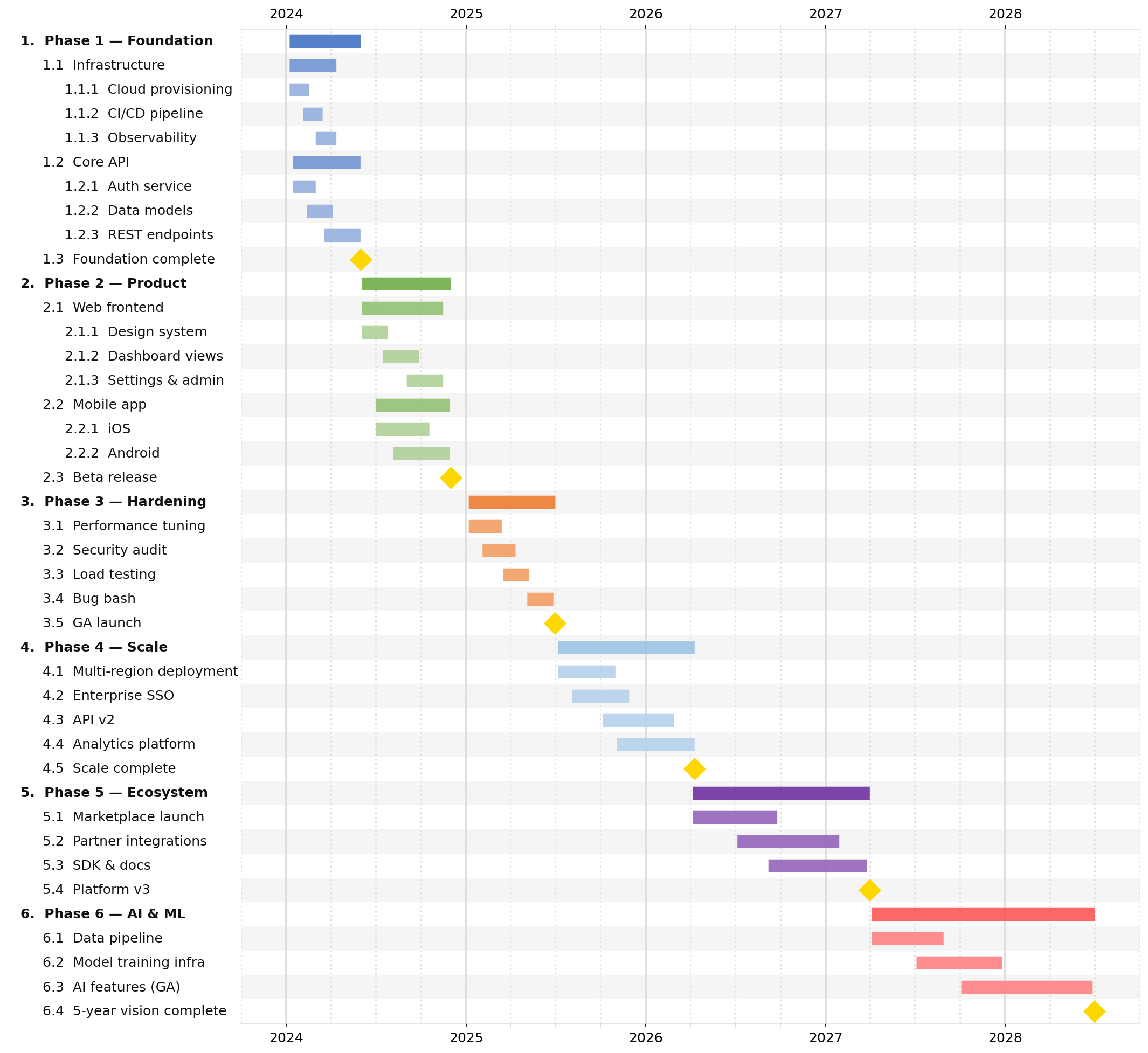
jsonantt draws two levels of tick marks: a major level (prominent gridlines, bold labels) and a minor level (lighter gridlines, no labels).
Field |
Default |
Description |
|---|---|---|
|
|
Major tick interval. One of |
|
|
Minor tick interval. Same values as |
|
|
Linewidth of major gridlines. |
|
|
Linewidth of minor gridlines. |
|
|
Where to draw the x-axis tick labels. Options: |
Typical tick combinations:
|
|
Best for |
|---|---|---|
|
|
Multi-year roadmaps |
|
|
1–2 year plans |
|
|
Quarterly sprints |
|
|
Short-horizon detail |
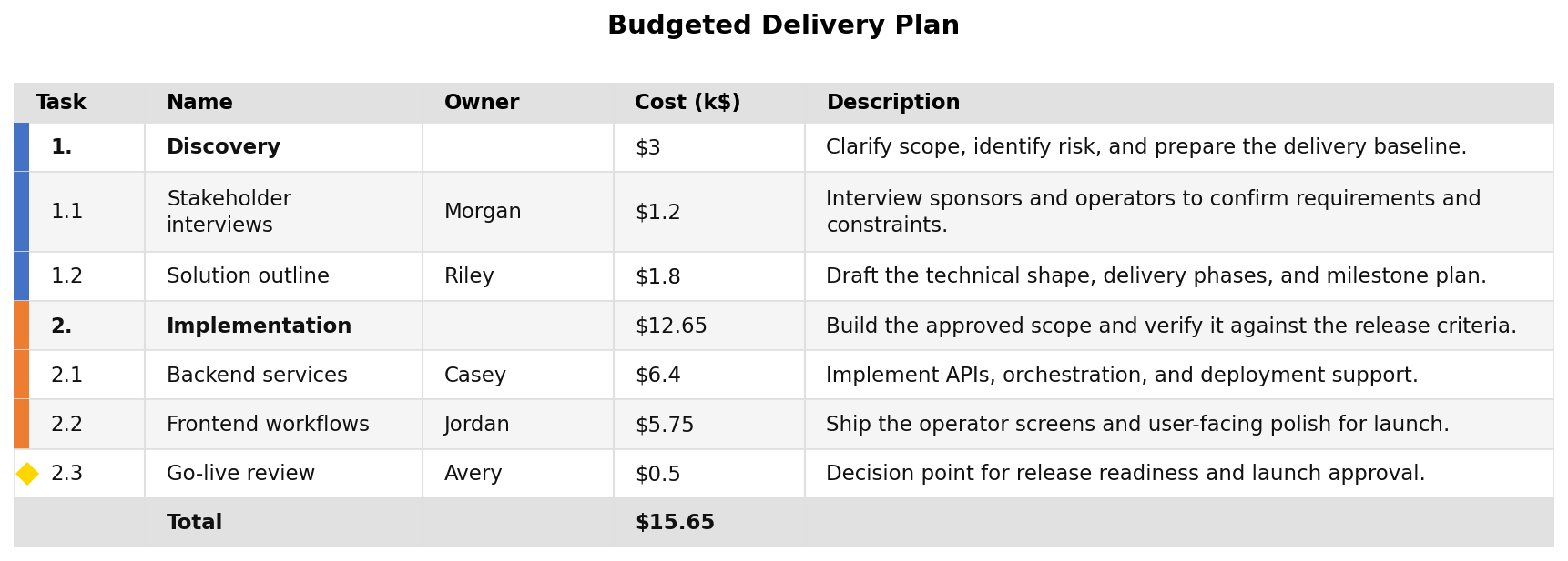
Table output
These fields only affect -t / --table output.
Field |
Default |
Description |
|---|---|---|
|
|
Show task bar colors as an accent gutter in the table. |
|
|
Draw milestone diamond markers in the table output. |
|
|
Ordered list of column definition objects. Empty list uses the default column set. See sub-table below. |
table_columns column definition object
Each entry in table_columns is an object with the following fields:
Field |
Type |
Default |
Description |
|---|---|---|---|
|
string |
required |
The data key to display. Built-in values: |
|
string |
same as |
Column header text. |
|
number |
auto |
Column width in pixels. |
|
string |
|
Text alignment: |
{
  "style": {
    "table_columns": [
      { "field": "name",  "label": "Task",       "width": 220 },
      { "field": "start", "label": "Start",      "width": 100, "align": "center" },
      { "field": "end",   "label": "End",        "width": 100, "align": "center" },
      { "field": "owner", "label": "Owner",      "width": 120 },
      { "field": "cost",  "label": "Budget ($)", "width": 100, "align": "right" }
    ]
  }
}
Full style example
This is the style block from the bundled complex.json example:
{
  "style": {
    "row_height": 0.3,
    "font_size": 12,
    "indent_size": 3,
    "subtask_lightening_pct": 25,
    "major_tick": "year",
    "minor_tick": "quarter",
    "tick_position": "both"
  }
}
And a maximally-configured reference block showing every field:
{
  "style": {
    "width": 16.0,
    "row_height": 0.28,
    "bar_height": 0.5,
    "font_size": 11.0,
    "indent_size": 3,
    "label_fraction": 0.0,
    "subtask_lightening_pct": 20,
    "background": "#FFFFFF",
    "grid_color": "#E0E0E0",
    "row_band_color": "#F5F5F5",
    "milestone_color": "#FFD700",
    "milestone_marker": "D",
    "milestone_size": 14.0,
    "major_tick": "year",
    "minor_tick": "quarter",
    "major_grid_width": 2.0,
    "minor_grid_width": 1.5,
    "tick_position": "top",
    "bold_tasks": true,
    "number_tasks": true,
    "table_colorize": true,
    "table_show_markers": true
  }
}